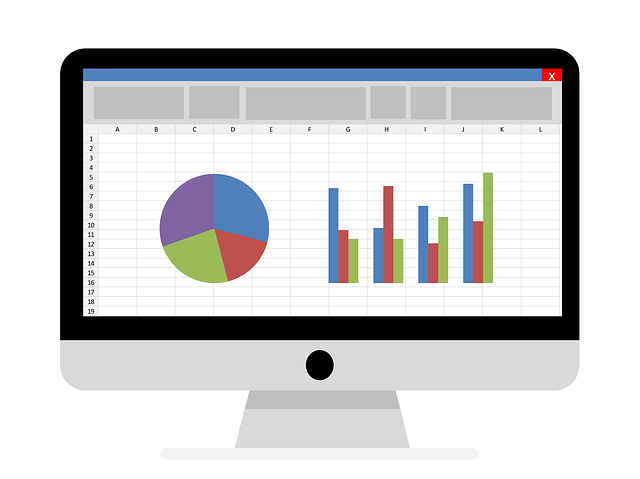
There are various principles of using excel chart labels properly and creating proper graphs in a course that you can learn on the internet.
You can also read different things about them in today’s guide.
Here we have different principles and other tips for making graphs that can be consistent with the results.
When handling chart elements in Excel, make a show to show the data clearly. Showing the info straightforwardly will make sure the data points are visibly apparent, and there is also proper text on the graph.
Tips To Show the Data-Clearly
- Make sure some data points are appropriately plotted and are completely visible.
- Ensure the reader can read your message relating to our excel chart elements.
- Make sure to maintain suitable scales and avoid different distortions.
- The graph has to be simple.
- Go for a design that has a clean design. Simple design does not mean the info is simple, so adequately designed graphs should enrich the reader with essential data.
- Avoid different distortions or colours, or pictograms. Make sure the reader can read the graph.
- Use the correct alignment on a proper scale.
- Good graphs require a proper estimation of different quantities that are represented. The reader needs to know where is the chart elements button in Excel and understand the graph scale.
- Use one linear scale to demonstrate the data.
- If it is impossible to use a single scale, use a standard scale and panels. You can also add chart elements to excel in the hierarchy.
- Do not use charts that are stacked and pie charts. Use chart labels to make things less complex.
- Add different grid lines to make a proper estimation. This tactic is usually adequate.
Keep A Visual Encoding More Transparent
Graphs integrate encodings in visual effects to represent different data. Readers have to interpret the diagram. They need to know the chart elements in excel to navigate the chart correctly. It will make the decoding process easier.
How Do You Get Rid or Add In Other Excel Chart Elements on A Chart?
In today’s guide, you will know the chart elements and where to get them.
When using the Excel lingo system, the chart elements include the chart title, the grid lines, the other chart labels, etc.
In the previous editions, people used chart elements to navigate the controls on the Layout tab of the ribbon, where the chart is picked from.
However, after that, you removed the layout tab and replaced it with a control feature, which is a plus symbol when picking the chart.
Chart elements are also a type of menu that lets you change different chart elements with other icons.
Let us go through a few different examples.
A good feature of chart elements is that they can create a preview on the worksheet when you hover across different options on the menu.
Select the feature you want in the chart title and click on the icon.
Key in the proper title. To get rid of the title, uncheck the whole icon again. You lose some custom text if you reinsert a chart title.
There are a lot of different elements, so you have to remember other customizations when you get rid of them and reinsert them.
Add different data labels to the chart, and follow similar processes.
There is a top-level menu in different chart elements with an extensive menu of extra options that you can see clearly.
When data labels are inserted on the chart, you might want to get rid of the grid lines on the chart.
Other chart elements can also be removed by ticking and unticking the check box.
Pick the proper data labels you want to get rid of and delete them.
Reuse the chart elements menu to make the vertical axis work again.
It is also crucial to know that you can use different chart elements in any way you wish. Once you pick one, there is a 4-headed arrow that you can drag.
Hold down the shift key to change the icon selection the right way.
How Does Excel Benefit Employees
Workers can also benefit from carrying out different Excel training, from creating more value to learning a new skill set to improve the work output.
Making the Skill Set Better
Once you learn how to hone your skills to improve your career, you can carry out advanced excel training that focuses on many other critical skills that you can use and value in different positions in the business. After going through the training, you can create data evaluation, create equations and create accessible data for readable purposes.
Making Sure Things Are More Efficient and Run More Productively
Excel is a crucial tool for making things more productive and lets workers carry out items more efficiently when handling a lot of data and different calculations. When you go through Excel at a higher level, you can use more advanced tools, finish the tasks and analyze the data faster. It lets them keep all the team members updated on the data, which improves the workflow process.
Turning Yourself Into A Useful Corporate Employee
Being a helpful employee will not just give you more job security. It also opens up a lot of chances for advancement. In this manner, you make yourself valuable to the company, become more efficient and educated, and have more skills in different job functions. This is what Excel training can give you when you train correctly.
Workers can also find ways to make themselves more valuable to the company so other workers will not easily replace them with a better skill set. Learning better skills is essential to stay on top of the whole game and give yourself better security.
Final Verdict
Now that you have learned about why chart labels are essential, it is time to take a short course on Excel and start using Excel at work!


